.png)
As a reminder:
The Altitude Infrastructure Group has been supporting local authorities for the digital development of territories for more than 15 years. In preparation for the announcement of an ambitious data management software project called ODIN, Haus Division has prepared a 2-minute explanatory video mixing motion graphics and 3D. This article will discuss the methods and obstacles encountered in the production of this video.
We saw in the previous article how the Haus Division created the identity of ODIN, which uses the three main colours of the Altitude Infra graphic charter. This decision turns out to be very practical when making this video serving as a bridge between the group and their tool! The most common composition element in the video will therefore be an orange solid, either a triangle (like the ODIN logo), or a rectangle, reminiscent of the database interface where everything fits.
The message of the video had previously been communicated privately in a video (produced in-house), which allowed us to build on and improve from it. Clarification of certain points, accessibility of some too technical terms, but also a shortening of the numerous enumerations and lists of statistics which affected the pace of the video, it is by talking directly with the communication team of Altitude Infra that we succeeded in pass the video below the 2 minute mark! A shot-by-shot storyboard was promptly proposed and approved, allowing the pre-production to progress.
Then came the time to create the multiple icons, objects and characters that will then be animated. We worked first with Adobe Illustrator, before switching to Adobe After Effects for video. Respect for Altitude Infra's colors was a key point in this graphic design, but some freedom also had to be taken to more effectively recall the software used before ODIN, Excel. This is the only touch of green in the first half of the video, the one in motion design.
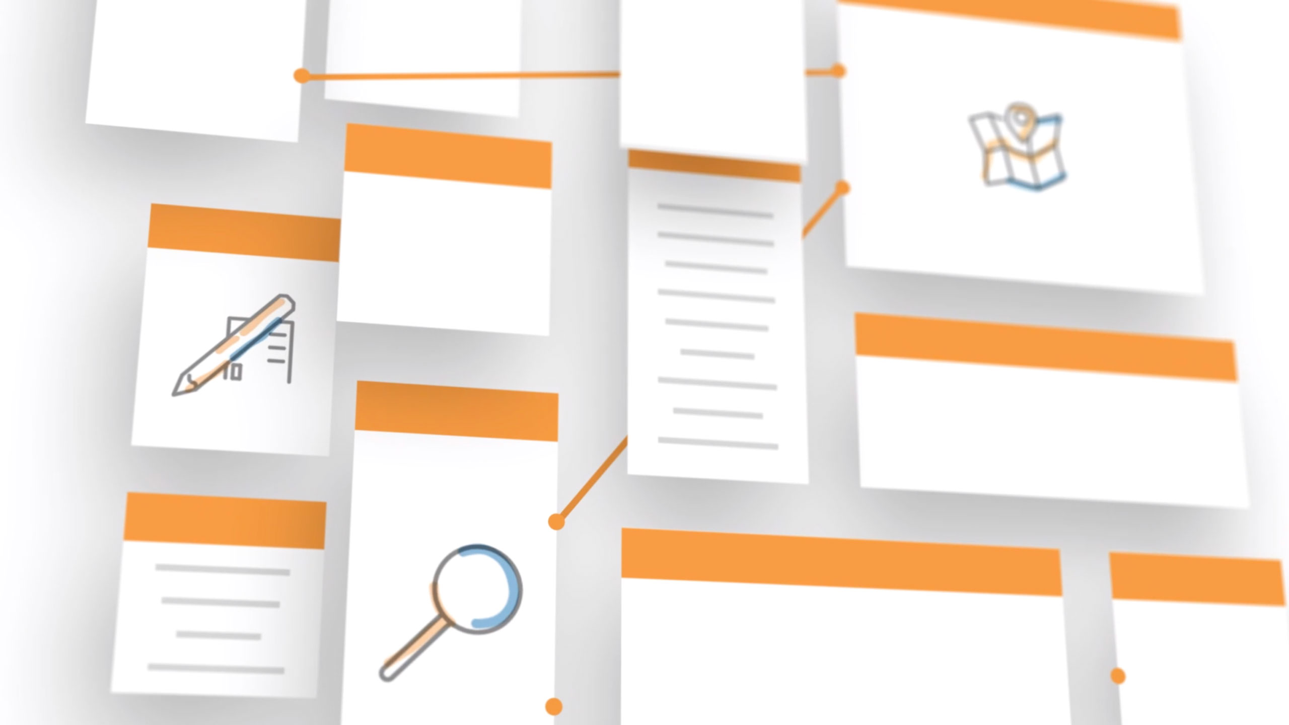
Why motion design? ODIN software is a solution to something very complex and large: formatting millions of data scattered across thousands of files. The internal video on which we relied for this project had chosen to show this issue through real images and screenshots of the databases. The rendering was unattractive or even intimidating for neophytes, which led us to a more refined and conceptual style.
The thousands of tables become simple rectangles of various sizes, and the excessively complex characters and scenes which represented the different professions of the Altitude group are replaced by icons. The message comes before the visuals, and the software interface is represented by its most basic skeleton.
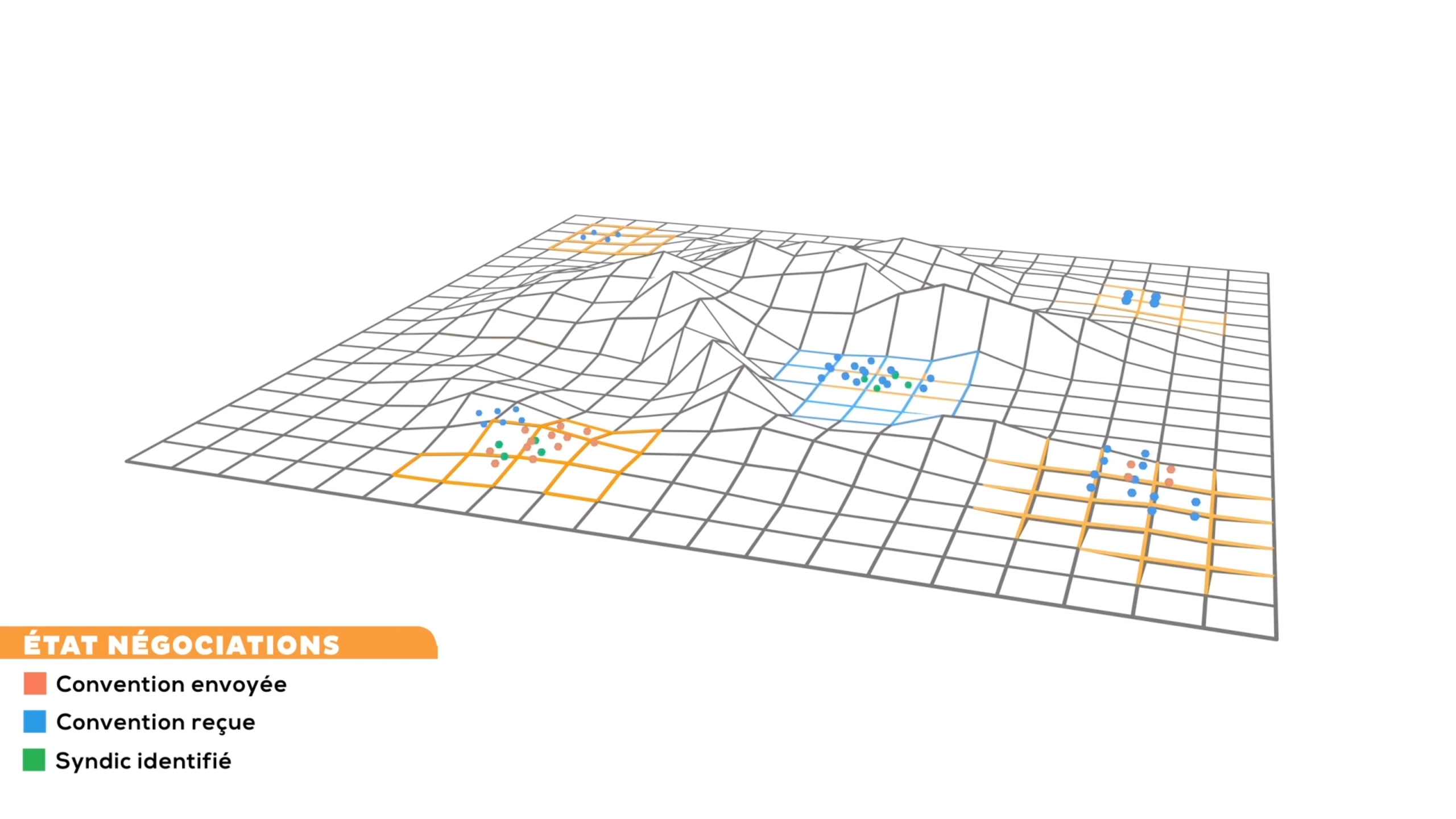
Since the second half of the video is three-dimensional, making fundamental changes to the shape of the shots used is a considerable waste of time. That's part of why the storyboard was so crucial, but we also realised that the storyboard was perhaps too ambitious. Achieving this as early as possible is one of the main reasons we were able to finish the project on time despite the tight deadline imposed by the date of the event.
It took a few exchanges and going through a few drafts before we achieved a satisfactory result, but we were pleasantly surprised at the understanding of the Altitude Infra team and the ease with which we achieved our goals during the meetings. In addition, those present at the event will have been able to recognise some of the graphics in the video decorating their stand and thus integrating the panel of visuals used by the group in their communication.


In the modern business world, creativity is valued as one of the most important entrepreneurial skills. Slowly, it is emerging that this is the best way to alleviate many of the problems that businesses are suffering today.
In preparation for the announcement of an ambitious data management software project called ODIN, Haus Division has prepared a hologram arousing the curiosity of visitors to the event to which Altitude Infra will unveil the latter.